How to get as good at online forms as Klarna
Author
Tim Axon
Published
Form fields are where good intentions go to die.

Users make it all the way through the funnel, only to stall when asked for too much, too soon, or too confusingly. But Klarna gets it right. Again and again.
While many brands obsess over homepage banners or checkout CTAs, Klarna focuses on the silent engine of conversion: forms. Whether you’re applying for credit, splitting a payment, or verifying your ID, the experience feels intuitive, trustworthy, and light-touch—despite the regulatory complexity underneath.
Klarna’s edge lies in its ability to blend financial precision with UX elegance, which is optimisation at its most disciplined.
Design for Trust, Then Speed
Klarna operates in one of the highest-friction categories imaginable: finance. Trust is non-negotiable. Every field, label, and interaction is engineered to feel safe and reassuring, before it feels fast.
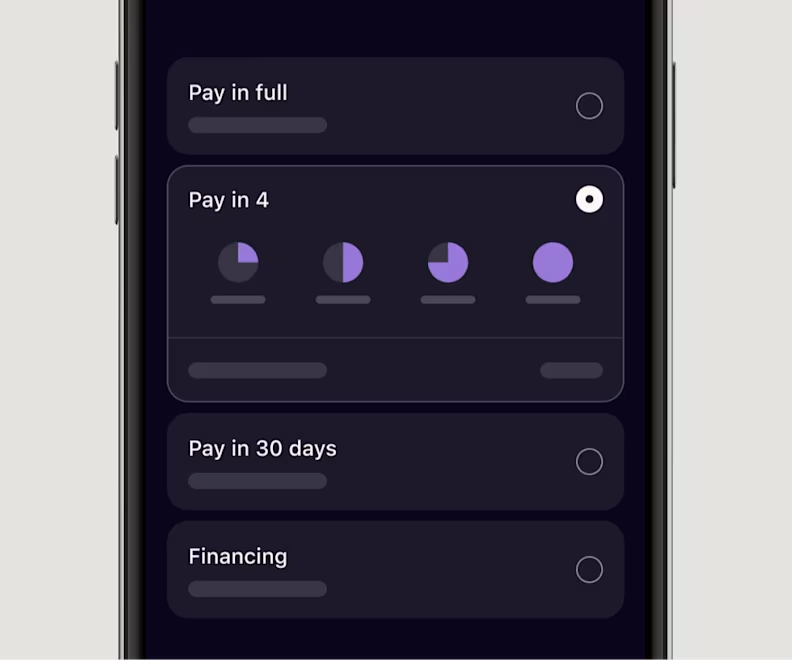
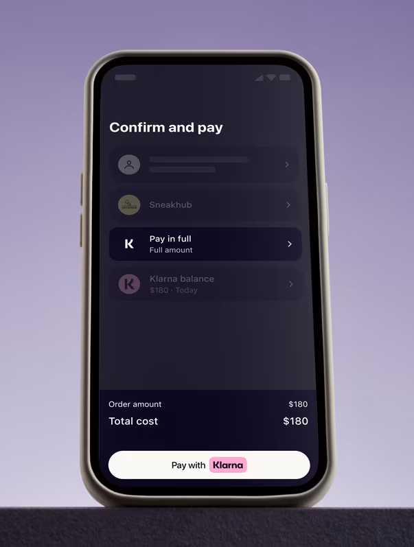
Labels are clear and conversational. Errors are gentle and human. Data input is progressive, often using inline validation and smart defaults. Instead of dumping users into long, intimidating forms, Klarna guides them step-by-step, building confidence along the way.
This is where many brands go wrong: they rush users to completion, instead of removing the fear of proceeding.
Optimise for Mobile Behaviour, Not Desktop Habits
Klarna’s mobile experience doesn’t try to shrink desktop forms. It rethinks them entirely. One field per screen. Predictive inputs. Smooth transitions. CTAs positioned exactly where thumbs rest. The order of inputs also reflects behavioural logic, not internal data structures.
This is a brand that’s tested the milliseconds between typing, tabbing, and tapping. The result? Fewer drop-offs, higher repeat usage, and a payment experience that people trust to use again.
Personalise in Real Time, Not in Retrospect
Form personalisation often means pre-filling fields with saved data. Klarna goes further—dynamically adjusting what it shows based on what you’ve done, what you’re eligible for, and how far you’ve gone before.
This makes forms feel like conversations, not applications. If you abandon a form and return, Klarna picks up where you left off. If you’ve used Klarna before, you see fewer steps. If you haven’t, it educates gently without overwhelming.
This adaptive, stateful approach turns generic flows into context-aware journeys—and boosts conversion by removing invisible friction.
Test the Moments That Seem Untestable
Most brands don’t test forms because they’re too “locked down.” Klarna tests relentlessly: field order, label wording, helper text placement, even the microcopy under a ZIP code box.
This commitment to experimentation in low-visibility areas sets them apart. They understand that form abandonment is revenue leakage and that reducing it is one of the most controllable levers in digital performance.
Winning the Form Optimisation Game
Klarna proves that form design isn’t about aesthetics—it’s about psychology, clarity, and respect for the user’s time and trust. They reduce friction not just by shortening steps, but by removing uncertainty.
Winning the Form Optimisation Game
For brands looking to optimise beyond the obvious, forms are your most underutilised asset. It’s where users say “yes”—or silently walk away.
The key to winning? Build trust early, guide users gently, and optimise every field like your revenue depends on it. Because it does.


Keep reading and learning

How to get as good at UX as Monzo
Learn More
How to Get as Good at Experimentation as Booking.com
Learn More