How to get as good at UX as Monzo

Author
Tim Axon
Published
In 2017 Monzo didn’t just redesign banking, it redefined user expectations.
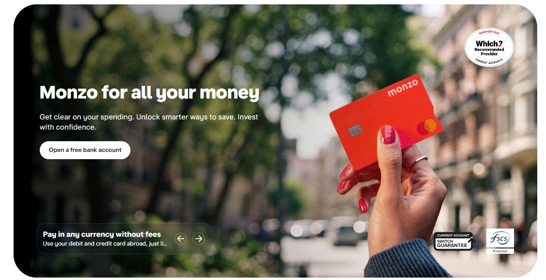
In an industry known for jargon, friction, and opacity, Monzo delivered a digital experience so seamless, users evangelised it.
While traditional banks buried functionality in labyrinthine menus, Monzo made everything from freezing a card to splitting a bill feel as intuitive as sending a text.
It understood that at the heart of UX stands emotional clarity. When money is involved, people want to feel informed, in control, and respected. Monzo made that the baseline.
The real genius? It didn’t just fix the interface. It fixed the experience.

Design Like Monzo: Clarity Over Complexity
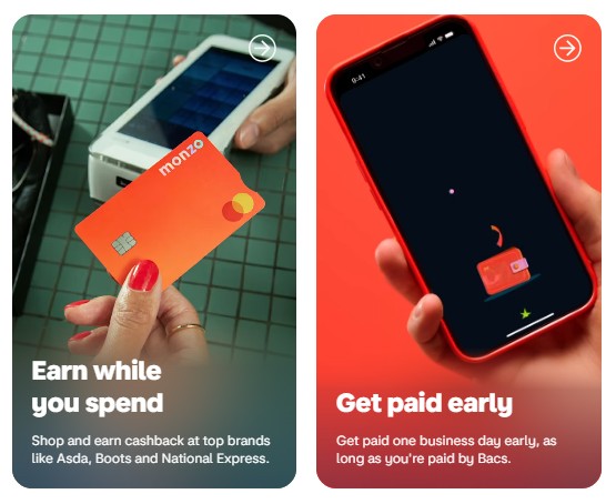
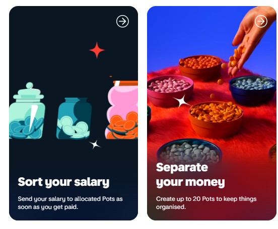
From the start, Monzo approached design with ruthless simplicity. It stripped banking back to what people actually wanted to do—check balances, track spending, send money—then made those tasks effortless.
There are no bloated dashboards. No confusing terminology. Just crisp typography, smart defaults, and interactions that feel obvious without explanation.
However, do not mistake the minimalist design for the sake of aesthetics, instead appreciate the cognitive economy. The fewer decisions users have to make, the faster they move—and the more trust they build. Every swipe, scroll, and tap is considered through the lens of reducing friction.
Think Like Monzo: UX Is Emotional
Monzo doesn’t just function well, it feels good. Users get instant notifications with every transaction. Categories and summaries are automatically organised. Microinteractions, like animations or reassuring copy, turn cold transactions into conversations.
This emotional layer is critical. In a category often associated with anxiety and uncertainty, Monzo offers comfort and control, making UX both visual and psychological.
They understand that tone of voice, timing, and transparency are part of the interface. When your app apologises for downtime like a human, users forgive. When your budgeting tool celebrates a saving milestone, users return.
Iterate Like Monzo: Built with Feedback, Not Assumptions
Monzo’s early growth was driven by obsessive user feedback. The product team didn’t just test flows, they co-created them. Ideas were discussed openly on community forums. Feature requests were tracked publicly. Even now, their changelogs read like honest conversations.
Iterate Like Monzo: Built with Feedback, Not Assumptions
This level of transparency built loyalty, but more importantly, it built relevance. The UX evolved with its users, not in isolation from them. Features weren’t released because they were possible—they were released because they were needed.
Great UX is user-led in practice.
Monzo didn’t succeed because it was pretty. It succeeded because it was clear. Because it removed fear, added confidence, and met people where they were. Its UX removed barriers and added meaning.
For brands that want to win in the experience economy, the lesson is simple: UX isn’t what it looks like. UX is how it works—and how it makes people feel.
So, to get as good at UX as Monzo, remove the noise, listen harder, and build with empathy at every interaction.


Keep reading and learning

How to get as good at online forms as Klarna
Learn More
How to Get as Good at Experimentation as Booking.com
Learn More